Brewing Brilliance: Bean 2 Ground Coffee's Digital Awakening
In the world of coffee alchemy, there's Bean 2 Ground Coffee – a maestro of artisanal blends, devoted to delivering the most heavenly coffee beans to its devotees. With a steaming cup of ambition, the brand set its sights on a digital revolution. Their mission? To infuse their online presence with the same passion that goes into every cup of their carefully crafted coffee.
Sipping the Challenge
But how do you turn roasted beans into an online experience that's as rich as their brews? This was the challenge, an enigma swirling in steam and aromatic mystique. The task at hand: to create a digital haven for coffee aficionados – a space that wouldn't just tell a story but would immerse, engage, and caffeinate the senses.
Steering the Ship
Leading this expedition was yours truly, the Lead UX Designer – charting a course for the design team to craft an online realm that was more than just a transactional platform. It was about brewing an emotional bond, invoking the comfort and passion that coffee embodies.
Exploring the Coffee Cosmos
Unveiling the Coffee Chronicles
To uncover the secrets of the coffee cosmos, we delved into user interviews, navigated surveys, and deciphered the scrolls of website analytics. With every click and response, we unlocked insights – the whispers of coffee enthusiasts' desires, guiding our design compass.
Roaming the Flavorscape: Blueprinting a Coffee Odyssey
Creating Pathways to Coffee Bliss
The map needed an upgrade – so we redefined the coffee trail. The website's structure was remastered, guided by the scent of flavor profiles, origins, and brewing methods. Navigating the world of beans was now a flavorful journey, each blend a destination.
Crafting Aesthetic Alchemy: From Pixels to Pour
Stirring the Visual Symphony
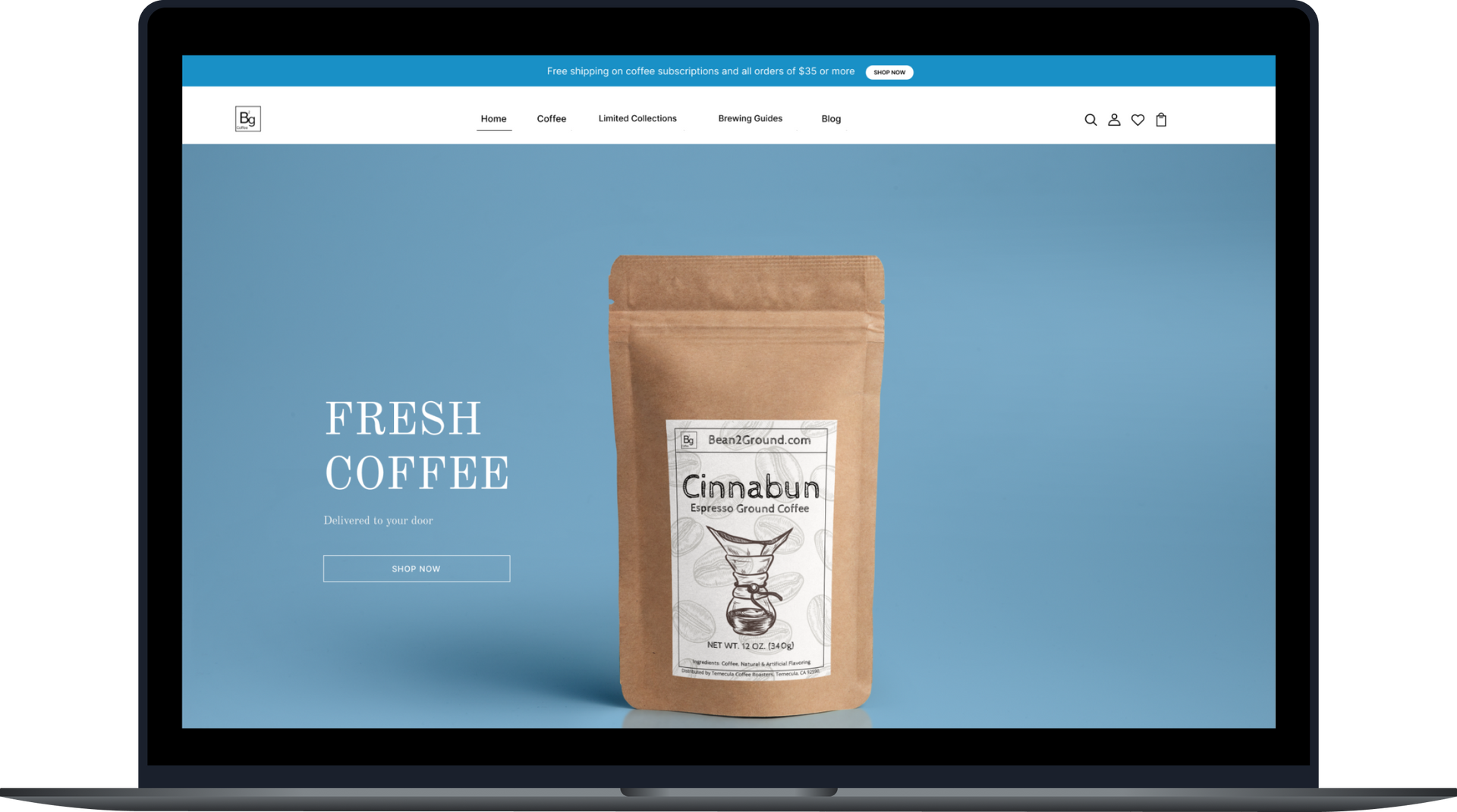
In collaboration with Bean 2 Ground Coffee's branding conjurors, we spun pixels into artistry. With earthy hues, visuals that danced like steam, and fonts that whispered the aroma, we painted a canvas that was as rich as the coffee it celebrated.
Magic Across Devices: Responsive Sorcery
Responsive Enchantment
In a world of screens both big and small, we wove a responsive spell. From desktops to tablets, and from pocket-sized phones to palms – the website transformed into a realm that seamlessly adjusted, ensuring the magic was never lost.
From Bean to Cup: Crafting Coffee Chronicles
Brewing Stories in Every Sip
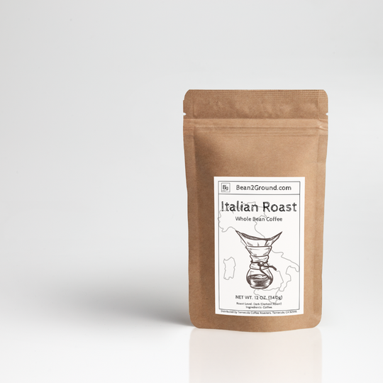
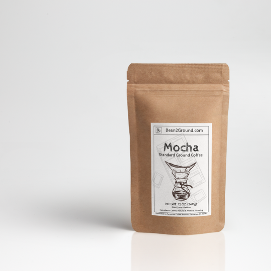
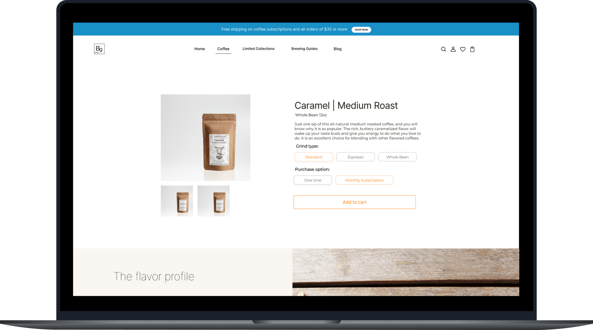
Product pages transformed into storytellers. A tapestry of images wove the journey from farm to cup. Detailed flavor tales and interactive notes added layers to every sip. Users didn't just buy coffee; they lived its story.
From Art to Science: Brewing Wisdom Unleashed
Brewing Wisdom: Interactive Guides
Coffee isn't just a drink; it's an art. So, we added interactive guides, ensuring every brew was perfection. From beans to pour, users became the masters of their coffee fate.
City skyline
Straight to Satisfaction: The Espresso Express
The Espresso Express
When it was time to pay the coffee homage, we streamlined the journey. A checkout process as smooth as the crema on an espresso. Clear signs of progress and helpful error whispers made sure every purchase was like a sip – smooth and satisfying.
From Bean 2 Screen: Coffee's Resurrection
The Roasted Resurgence
As the curtain rose on the new digital era, the aroma of success filled the air:
01. Engagement Elevation
Users lingered longer, explored deeper, and clicked with fervor. The design's embrace led to longer sessions and fewer hasty exits.
02. Conversion Magic
Product pages that told tales and a checkout process that sparkled – conversions soared by a delicious 20%. Users didn't just browse; they indulged.
03. Words of Praise
Users applauded the new design, lauding its friendliness and elegance. The seamless journey and interactive guides earned the spotlight.
04. Beans to Bonds
The design wasn't just pixels; it was an emotional connection. Brand loyalty surged, translating to repeat visits and recommendations whispered over coffee cups.
