Case study · rebrand + website · automotive · client work

Conquest Customs was a custom motorcycle shop with a national award.
I rebuilt it as a brand that could carry a hero product.

A full rebrand and multi-page website for an award-winning custom motorcycle shop in Boca Raton, FL. At its core this was a brand-architecture problem: preserving an established shop identity while launching ThunderBall Scout as a flagship product. Solo on design and the front-end, anchored on a 55-respondent survey.

Role: Solo designer + front-end Client: Conquest Customs / ThunderBall Scout (paid) Location: Boca Raton, FL Research: 55 survey respondents · ages 20–50 Deliverable: Six-page site + brand architecture

The problem

An award-winning shop with a placeholder website and a hero product launching into it

🏆

"Considering the impressive, ongoing success being achieved by Scott personally and by his business, Conquest Customs, the Victory Riders Blog is naming him 2015 Victory Custom Builder of the Year."

Victory Motorcycles · Victory Riders Blog

Conquest Customs had earned the kind of credibility most shops in the category never reach: a national award, a working garage in Boca Raton, a custom-build reputation, and a loyal customer base built over years. The digital surface said none of that. The site was a holdover from an earlier era of the business, with generic templates, no mobile, the 2015 award buried in a blog post, and no real entry point for someone meeting the brand for the first time.

On paper the brief was a rebuild. The real job was an architecture problem. ThunderBall Scout, a signature customisable motorcycle, was becoming the flagship the business was betting on. The design challenge wasn't a new colour palette. It was deciding how a legacy shop brand and a new hero product were going to live on the same site without one swallowing the other. Every page descends from that decision.

the shop brand

Conquest Customs

Award-winning custom motorcycle builder. The legacy, the reputation, the physical garage. Named 2015 Victory Custom Builder of the Year. The trust anchor for both audiences.

the hero product

ThunderBall Scout

The signature customisable motorcycle, the flagship the business is betting on. Designed to attract a new generation of riders to the shop without alienating the loyalists who already know the name.

Brand

A national-award shop with no digital surface for it

Conquest Customs had been named 2015 Victory Custom Builder of the Year. That credibility lived in a blog post and a few framed mentions in the physical garage. The website read like a placeholder: generic, dated, with no signal that the shop had won anything, let alone a national title.

Strategy

A hero product launching with nowhere to live

ThunderBall Scout, a signature customisable build, was becoming the flagship the business was betting on. There was no page for it, no name system, and no architecture to hold it. Dropping it onto the existing site as another menu item would have buried it next to a Contact link.

Reach

No mobile experience on a premium product page

The existing site had no responsive design. Riders researching custom builds on their phones, already the majority of traffic for the category, were getting a broken, zoomed-out desktop page representing a five-figure motorcycle. A premium product with a broken first impression.


The constraint

The loyalist customer base was the most valuable thing the business had, and the easiest to break

Conquest Customs already had an audience that trusted the name, knew the garage, came back for Parts, and recommended the shop to friends. That trust was the asset every other decision had to protect. The temptation in a rebrand is to lead with the new thing and let the legacy fade, and the survey was explicit that doing that would have burned the equity that made the new product launch credible in the first place. Every decision below was made inside that boundary. Nothing could erase the Conquest name, the 2015 award, or the assumption that loyalists could still find their way to Parts and the Garage without learning a new site. The new product had to fit into that house rather than replace it.


The decisions

Three calls that shaped the rebrand

These are the points where I had credible options to choose between. For each one I've laid out what was on the table, why I picked what I did, and what it cost.

Decision 01

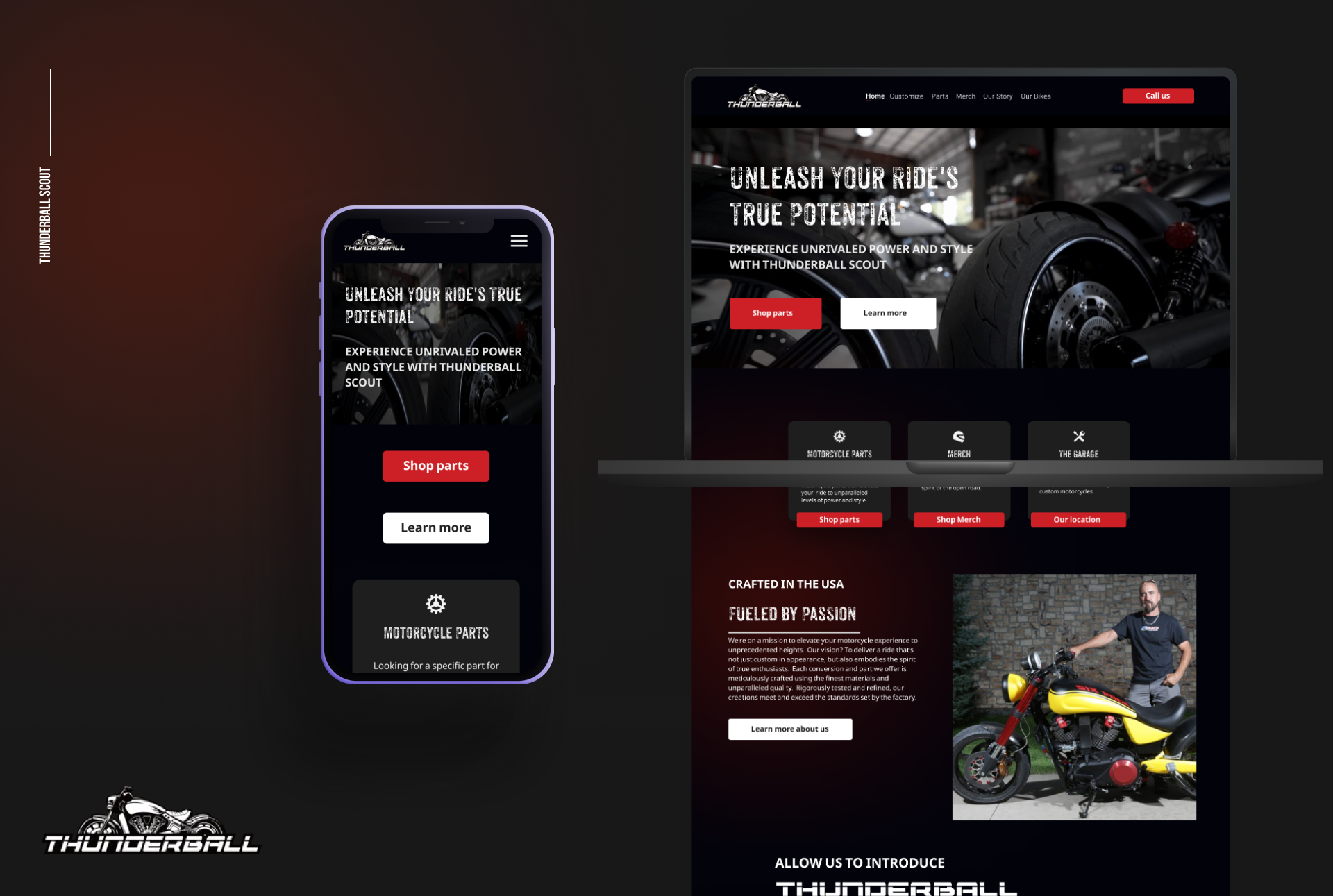
Keep Conquest Customs, launch ThunderBall Scout, and run them as one architecture.

The options on the table

  1. 01 Retire the Conquest Customs name and rebuild the whole business around ThunderBall Scout. A clean break with a single brand and the simplest story, but the survey was explicit that the existing audience's trust in Conquest was the most valuable asset the business had.
  2. 02 Hide Conquest in a footer and lead with ThunderBall everywhere. A cosmetic compromise that keeps the name technically alive but burns the equity by signalling the legacy doesn't matter anymore.
  3. 03 Dual-brand architecture. Conquest Customs as the parent shop, carrying the legacy, the garage, the 2015 award, and the parts and service business. ThunderBall Scout as the hero product nested under it, with the bike, the enquiry flow, and the ambition.

Why this one

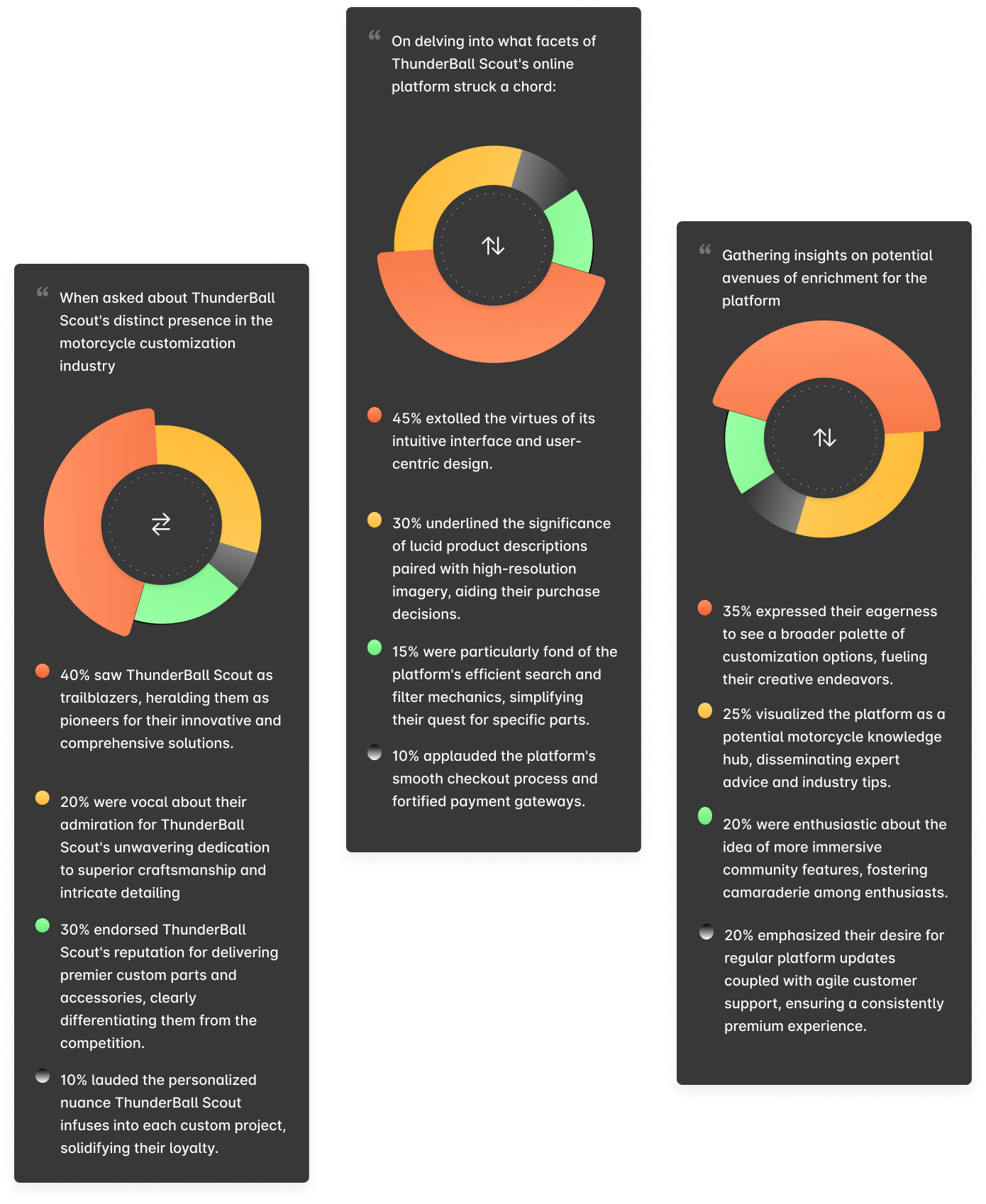
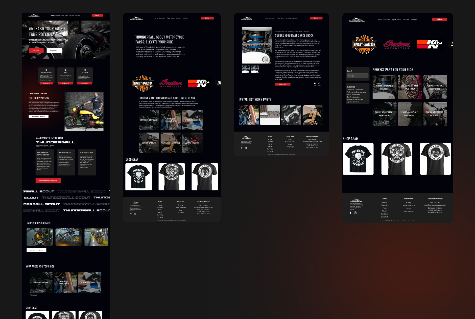
The survey closed the debate. Asked directly whether they'd still recognise the business if the Conquest name was retired, the loyalist segment pushed back hard, because the name was the trust. Asked separately what excited them about the new direction, both segments named the new product rather than a new shop. The research was telling me the answer was both, and that the architecture was the design problem. The dual-brand structure let Conquest carry the credibility (the award, the garage, the parts catalog) while ThunderBall Scout got its own surface to act like a flagship, with its own page, voice, and enquiry flow, and without orphaning either audience.

The trade-off

It's twice the surface to design and maintain, with two voices to keep distinct across the site. Every shared page (homepage, story, footer) became a balancing act over when Conquest leads, when ThunderBall does, and how they sit together without competing for attention. The system is more disciplined than a single-brand site would have been, and the client has to keep operating inside that discipline. I accepted it because the alternative was burning the equity that made the new launch credible in the first place.

Decision 02

One nav bar with two implicit paths, instead of forcing both audiences through the same funnel.

The options on the table

  1. 01 Mirror the old IA (Home, About, Parts, Contact) and bolt on a ThunderBall Scout page. Familiar to loyalists, but newcomers land on a shop site for a brand they don't know yet and bounce.
  2. 02 Split into two sites or two URLs, one for Conquest and one for ThunderBall Scout. It solves the audience clash but doubles the maintenance, splits SEO, and signals to loyalists that the new product isn't really part of the shop they trust.
  3. 03 A single nav with two implicit entry paths. ThunderBall Scout and Our Story surface first for newcomers (discovery and trust), while The Garage, Parts, and Merch sit alongside for loyalists who already know what they came for. One site, six pages, serving two journeys.

Why this one

The survey showed the segments wanted different things on the first scroll. Newcomers wanted to know what the product is and whether to take the shop seriously. Loyalists wanted to know where Parts went and how to book service. Trying to serve both with the same hero, or the same primary CTA, would have compromised both. Two implicit paths gave each segment a clean entry without forcing either through an onboarding moment it didn't need. The shared elements (footer, Our Story, the award treatment) became the bridge between the two journeys instead of a funnel both had to walk through.

The trade-off

The site couldn't be reductive. Six page types is more than the budget would have liked, and every page had to justify itself against one of the two journeys. Anything that didn't, like a generic blog, a press page, or a newsletter-signup hero, got cut. The nav stayed simple because the page set did the architectural work. I'd take it, since the alternative was a hero unit fighting itself for two different audiences.

Decision 03

Surface the 2015 award as a sourced blockquote, not a logo or a badge.

The options on the table

  1. 01 Leave it in the blog post where it was originally announced. Technically accurate to the source, and where the existing site had it, but the credibility never reaches anyone who isn't already searching for it.
  2. 02 Treat it like a badge, a small "Award-Winning Custom Builder" mark in the footer or near the logo. Common in the category, but easy to read as self-awarded marketing copy, especially without naming the publication or the year.
  3. 03 Surface the original quote as a full blockquote on Our Story, with the source (Victory Riders Blog) attributed underneath. Word-for-word, dated, and sourced, the kind of thing a skeptic would screenshot if they doubted it.

Why this one

The survey ranked third-party credibility as the single highest-trust signal across both segments, newcomers especially. A footer badge would have done the opposite of what the asset was worth, reading like an in-house claim instead of a national-press citation. Putting the original quote on the page as a blockquote, with the publication named and the year stamped, turned the most valuable piece of equity the business already owned into the trust anchor for the new audience too. The same asset works for both journeys, in one place, with no copywriting trick needed, because the source itself is the proof.

The trade-off

Anchoring trust on a quote dated 2015 puts a clock on it. The single dated artefact is doing real work right now, but every passing year makes the page want a more recent equivalent, whether a press mention, a new award, or a customer feature. The Our Story page is built to accept that addition without re-architecting, since it's a blockquote slot rather than a hero unit, but keeping the trust layer current is now part of the shop's ongoing operation rather than a one-time launch deliverable.


What I built

Eleven pieces of work: a brand system, an IA, six page types, and a custom enquiry flow

Everything below shipped as part of the rebrand: the brand system, the architecture, every page template, the responsive layer, and the custom enquiry form. Design and front-end, solo.

  • Dual-brand identity system

    Lockup hierarchy and usage rules for how Conquest Customs (parent shop) and ThunderBall Scout (hero product) appear together. Defined which one leads on shared surfaces, how they sit side-by-side without competing, and what each one is allowed to do alone.

  • Sub-brand naming + voice system

    A vocabulary the shop could keep using after launch, covering how to name new builds, parts categories, and merch lines without inventing rules each time. Conquest speaks history and craft, and ThunderBall speaks ambition and performance. This is the texture beat below.

  • Two-path information architecture

    A single nav serving loyalists and newcomers through two implicit entry paths. ThunderBall Scout and Our Story for discovery, and Garage, Parts, and Merch for the shop business. Built on top of the segment finding the 55-respondent survey surfaced.

  • Homepage: gateway to both journeys

    Hero leading with ThunderBall Scout (the new audience hook), Conquest Customs context one scroll down (legacy + award), entry chips into Parts, Garage, and Merch for returning customers. The page front-loads discovery without burying the shop.

  • ThunderBall Scout product page

    The flagship surface: performance specs, customisation options, photography direction, and the custom enquiry form at the close. The bike gets its own room without leaving the shop. It's designed to start a conversation rather than close a transaction.

  • Our Story: the trust anchor page

    Conquest Customs history, the physical garage, the people, and the 2015 Victory Custom Builder of the Year blockquote with the source attributed. The single highest-trust surface for both audiences, anchored on a third-party quote rather than in-house marketing copy.

  • The Garage: location, service, booking

    Physical-shop information for loyalists: address, service offerings, and a booking entry point. Designed to be easy to land on directly from a phone search, with the loyalist journey assumed from the first scroll.

  • Parts category system

    Performance, Lighting, Maintenance, Suspension, and Pulleys, five sub-categories with their own pages and a shared template. Built to scale, so the shop can add a new category inside the same system without breaking the IA or the visual hierarchy.

  • Merch storefront

    Hoodies, tees, and branded accessories, the lowest-consideration purchase on the site. Treated as a fast lane with minimal copy, product-led visuals, and a clean checkout, in the same brand voice as the rest of the shop side.

  • Custom ThunderBall Scout enquiry form

    Contact method preference (phone, email, SMS), referral tracking, and a build-interest field. A considered-purchase capture flow built for a five-figure custom motorcycle, where the form starts a sales conversation rather than pretending to be a checkout.

  • Responsive system across the full site

    Every page rebuilt to work on phone, tablet, and desktop, where the original site had none. Photography crops, type scale, nav behaviour, and the enquiry form were all tuned per breakpoint so the premium product reads premium on every device.


What I owned

Design end-to-end, plus the front-end the site shipped on

Brand + identity

Dual-brand architecture, end-to-end

Defined how Conquest Customs (the shop, the legacy) and ThunderBall Scout (the hero product) coexist on a single site without one swallowing the other. Naming structure, voice rules, lockup hierarchy, and how each one shows up across page types, all shipped as a working system rather than a guidelines deck.

UX + IA

Two-segment information architecture

The 55-respondent survey surfaced two distinct audiences: loyalists who knew Conquest and arrived to shop Parts or book service, and newcomers discovering ThunderBall Scout fresh. I built a single nav that served both groups through two implicit paths, instead of forcing either group through the wrong funnel.

Visual + UI

A red, performance-coded visual language

Dark backgrounds, high-contrast typography, and strong photography direction. The visual language had to feel premium and aggressive, matching the physical character of the product, while staying clean enough to carry six page types and a custom enquiry flow.

Front-end

Shipped the site, not just the design

Every screen here is a real page rather than a Figma export. I built the templates, the responsive system, and the custom ThunderBall Scout enquiry form inside the platform the client was on. The brand decisions and the implementation were the same conversation, with no handoff translation and no shipping a slimmer version of the work.


Research

55 respondents · ages 20–50 · two segments · three findings

The survey did more work than any other input on this project. It established that the audience split cleanly in two, that the Conquest name still had real equity with the loyalist segment, and that third-party credibility was the highest-trust signal for both groups. Every architectural decision below traces back to one of those three findings.


The design

Six page types, one architecture, one nav serving two journeys

The full page set. Each one accountable to a distinct user need within the dual-brand system.

🏠
Homepage
Gateway: ThunderBall hero, Conquest context, entry chips into Parts, Garage, and Merch
🏍️
ThunderBall Scout
Hero product page + custom enquiry form
📖
Our Story
2015 Victory award blockquote, source-attributed. The trust anchor.
🔧
The Garage
Location, service, booking, the loyalist landing surface
⚙️
Parts
Performance · Lighting · Maintenance · Suspension · Pulleys
👕
Merch
Hoodies, tees, branded accessories: the fast-lane storefront

The texture

The layer I spent the most time on was the naming, where Conquest the legacy and ThunderBall the hero product had to coexist without one swallowing the other

The visible deliverable on this project is the website. The real deliverable was the naming and voice system underneath it. Once the dual-brand architecture was the call, every page became a question of which name leads here, what voice it's speaking in, and what happens to the other one. Branding everything Conquest would have erased the new product, and renaming the shop ThunderBall would have erased the equity that made the new product credible. Neither extreme worked, so the job was figuring out the middle, and the middle isn't a lockup. It's a set of rules.

Here's the system that landed. Conquest Customs is the parent shop, and it speaks history, craftsmanship, the physical garage, and the people. ThunderBall Scout is the hero product, and it speaks performance, ambition, customisation, and what's possible. The Parts categories (Performance, Lighting, Maintenance, Suspension, Pulleys) inherit from Conquest, because they're shop products rather than Scout products, so the voice stays in the shop register. The homepage is the only surface where both brands lead together, and even there the order is rule-based: ThunderBall Scout gets the hero for newcomer entry, Conquest carries the second scroll for legacy context, and the two settle into the same footer. The naming hierarchy itself took several rounds. I tested "ThunderBall Scout by Conquest Customs," "Conquest ThunderBall," and the free-standing pair that shipped, before landing on the version where each name does its own job and they meet only where the architecture says they should.

Building it as a system instead of a one-off lockup means the client can keep using it after I'm out of the room. When a new build line, parts category, or merch drop comes along, they have the rules to name and voice it without re-asking the question every time. That's the part I'm proudest of: the brand keeps doing its job on a day I'm not there.


Impact

What launched and what it set up

6
Page types designed and shipped: home, product, story, garage, parts, merch
live at conquestcustoms.com
55
Survey respondents informing IA, naming, and trust hierarchy
ages 20–50, two segments
2→1
Brand identities running under one architecture
Conquest Customs + ThunderBall Scout
0→✓
Mobile responsiveness, where the original site had none
desktop, tablet, phone

The rebuild shipped as a six-page responsive site running both brands under one architecture. Conquest Customs carries the shop business and the 2015 Victory Custom Builder of the Year trust anchor, and ThunderBall Scout runs as a flagship product page with a custom enquiry flow built for a five-figure considered purchase. The site is live at conquestcustoms.com. The quieter win is the naming and voice system the client kept using after launch, with new builds, categories, and merch all named inside the same vocabulary and no re-engagement required.

Shipped solo as the designer and front-end developer. Research, brand architecture, IA, visual design, every page template, the responsive system, and the custom ThunderBall Scout enquiry form were all mine. The 2015 Victory Custom Builder of the Year award was earned by Scott and Conquest Customs before this engagement. I designed how that existing equity got surfaced, not the equity itself. The 55-respondent survey was fielded as part of the discovery phase, ages 20 to 50, across the loyalist and newcomer segments.

What this project taught me about brand architecture.

When a business with real equity launches something new, the central design problem isn't the new thing's visual identity. It's the relationship between the new thing and the existing one. The instinct, mine and the client's and the category's, is to lead with the launch and let the legacy fade. The survey closed that debate hard. The work was building a structure where both names get to do their own job and the system tells you which one leads on which surface. Six pages are the visible deliverable, but the real one is a set of rules that keeps producing right answers after the engagement ends.

Why the designer-who-codes matters here.

The naming system, the IA, and the enquiry form all had to ship inside a real site rather than a deck. Holding both layers meant the brand decisions could ship without translation loss. When the dual-brand rules said the homepage hero leads with ThunderBall and the second scroll carries Conquest, that's exactly what got built, not a slimmer version of it. The custom enquiry form on the Scout page is the clearest example. It was a brand decision (the bike starts a conversation rather than a transaction), an IA decision (where it lives in the page), a UX decision (contact preference and referral tracking), and a build problem (how to make the platform produce it), all collapsed into one conversation because the same person held all of them.

What's next.

The next move on a site like this is the loyalist subscription layer: service reminders, parts re-order, and return-customer pricing. The audience already exists, the architecture already separates loyalists from newcomers, and the data the enquiry flow produces is the start of a real customer record. Turning that record into a repeat-purchase surface, and letting the Conquest shop side carry it without pulling ThunderBall the product side into operational copy, is the natural next move for any brand-architecture engagement at this shape.